
A Case for Rethinking Alert Architecture in High-Stakes Operational Interfaces
How to maintain user context and cultivate alerts across eco-systems.

The alert worked. The system didn’t.
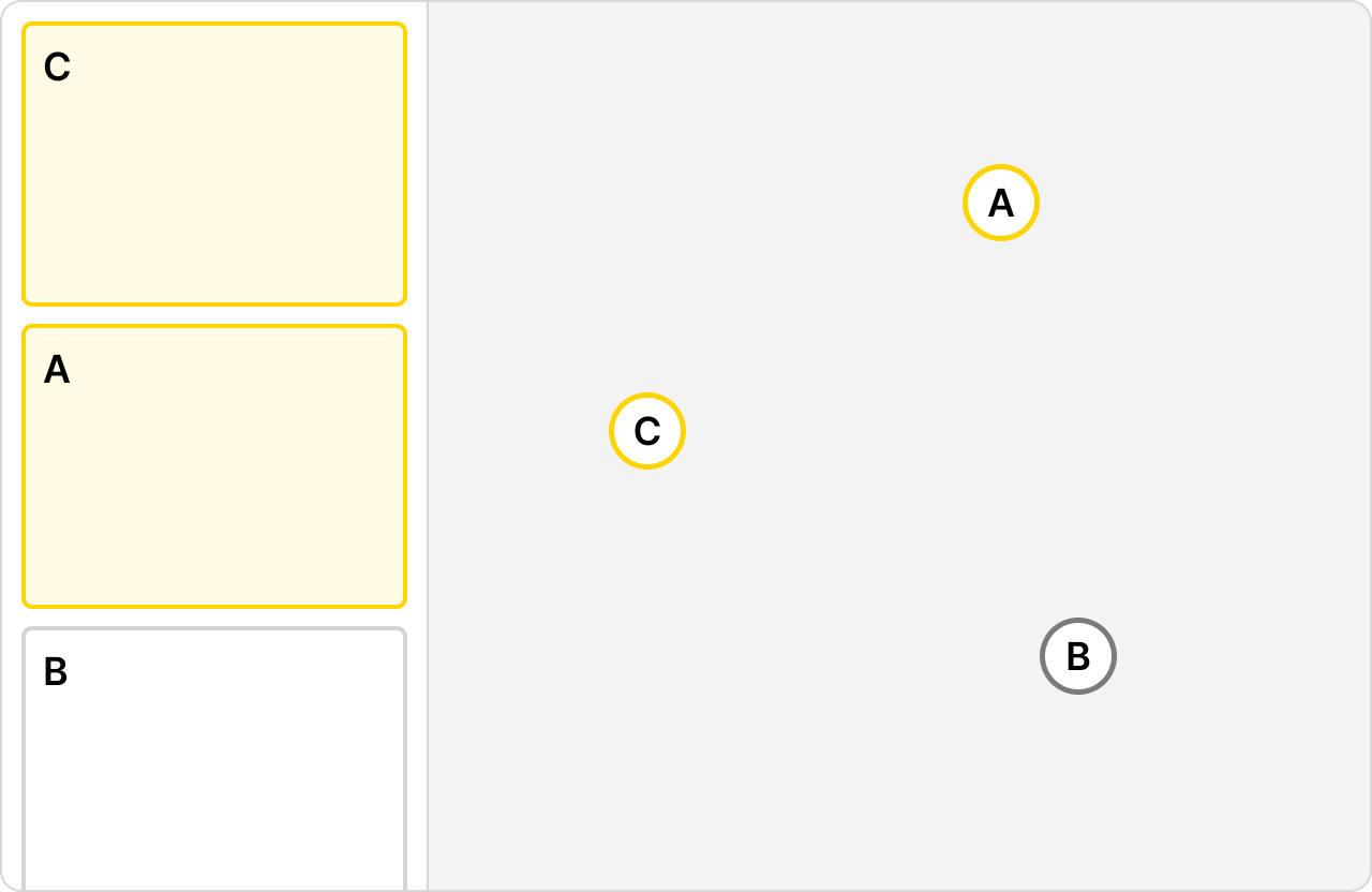
Picture an operator at a workstation. On their screen is a live map. Beside it, a scroll-able panel of cards, each one a summary of an asset and everything attached to it. A vessel carrying millions in cargo through contested waters. A mission with multiple aircraft and personnel assigned. The card and the dot on the map are the same thing rendered differently.
This operator is focused on a “theater” or a geographic slice of a larger region. They also have a to-do list and it’s not static, it’s defined by the system. When something needs attention it rises, when it’s resolved the next prioritized item takes its place.
Ideally this flow is manageable. The operator moves through their queue, the map reflects reality, and the panel keeps them oriented to what matters most.
Then an alert fires, the kind designed to grab their attention. That notification routes them into an entirely new process or even a separate application. The map keeps moving. The assets don’t pause. The theater they were responsible for continues without them.
Our response to this as designers has been to treat it as a volume problem. More alerts equal more noise equal more dismissals, so the solution is reduction and prioritization. Fire fewer alerts, make them more relevant, earn back trust.
This is necessary work. It’s also not the whole story.
It assumes the failure lives in how many alerts fire and how well they are targeted. It does not ask what happens when the alert architecture itself is under designed. The context switching for an operator is treated as an engineering concern, not a design one.
This piece proposes a framework for high-stakes map-based operational tools drawn from domain experience rather than empirical study. The structural patterns are common in numerous industries, and so are the points of failure.
A continuum, not a hierarchy
Most resources on alert design treats notification levels as separate categories with a clear scale of bad to worse. The standard pattern is that more severe alerts demand more disruptive design patterns, and that disruption scales from passive to urgent to critical.
In high-stakes operational interfaces this assumption causes problems, and building alert architecture on top of it produces systems that make it look like operator error rather than a design error.
In these systems alerting exists on a continuum.
At one end, state changes surface passively through the UI elements the operator is already watching. A card reorders in the panel. A color shifts. The dot on the map reflects the change. These are not notifications. They are the system doing triage work for the operator, surfacing events attached to assets without demanding a user’s full attention. An asset approaching a boundary, a scheduled departure window opening, a documentation gap flagged before an asset enters live monitoring. The asset itself is not the problem. The event attached to it is, and many of those events are anticipated, which is precisely why they can be handled passively within the operator’s existing field of attention.fig
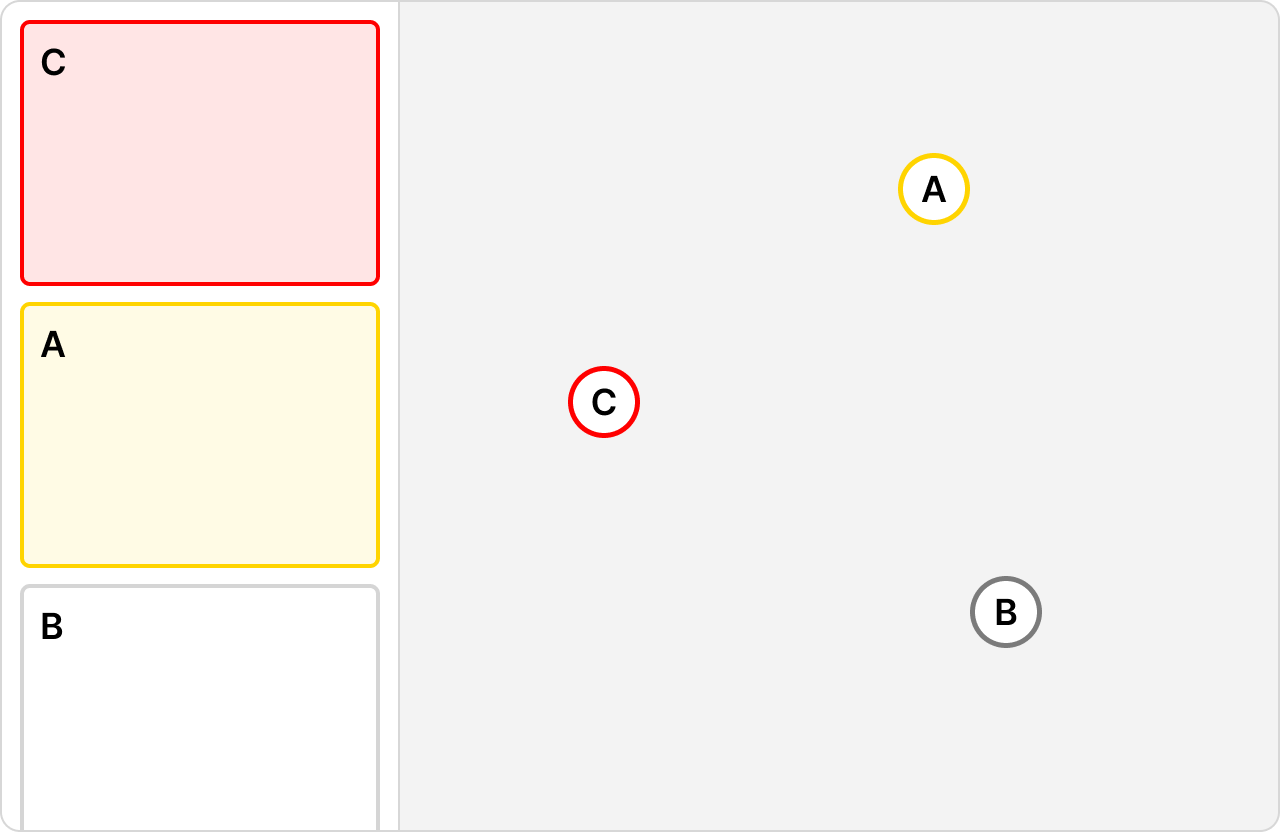
As severity increases, the same UI pattern takes on different meaning. The card that was yellow is now red. The reordering that felt routine now signals something that cannot wait. No new design pattern is introduced. This matters because it means the visual system carries an enormous amount of weight. The difference between a routine update and an urgent situation is expressed through the same components at different thresholds. When that distinction is unclear, operators stop trusting the panel entirely.
This is where the conventional severity assumption collapses.
The common mental model places in-app interrupts somewhere in the middle of the spectrum, less severe than a cross-system alert that demands the operator leave the application entirely. Operationally, the in-app interrupt is often the most destructive point on the continuum.
When a significant in-app event fires, it takes over the operator’s primary interface with no spatial separation, no clear signal of origin, and no natural boundary between handling the alert and doing the job. The manual processes that follow can consume minutes or the better part of an hour. An asset has gone off route. The operator calls the pilot/driver, notifies the employing company, contacts the corresponding partners or command structure. When they return to the map the panel has completely reordered. The context they had constructed is gone. There is no recovery mechanism built into the design because the design never anticipated the operator needing to return to a picture that moved on without them.
A cross-system alert that opens in a separate window is, counterintuitively, more recoverable. The map stays visible in the original window. The operator retains their spatial picture. The external origin of the alert is legible through context alone. The disruption is real but the operator has an anchor. They know where they are and what they were doing because they can still see it.
The in-app interrupt has no such anchor. It is the least recoverable alert type in the system and it sits exactly where designers are least likely to look for the hardest problem. Existing literature and research on enterprise notification design on alert fatigue does not address this. The conversation has been about volume and relevance. This framework is about structure and recovery.
The Problem Is Not New, But The Stakes Are Higher Here
Alert fatigue is well documented. A homeowner in Texas swipes away a hail warning because his phone has conditioned him to treat notifications as noise (this definitely didn’t happen to me and didn’t cost me $$$ in auto repairs). That consumer pattern, bad habits leading to dismissal, is what most alert fatigue research describes.
Enterprise operational contexts produce a different failure mode entirely.
Professional operators don’t ignore alerts. They get flooded and make mistakes. The distinction matters because the design response is different. A consumer needs better relevance and targeting. An operator under alert load needs a system that reduces cognitive burden without reducing information fidelity.
If an industrial monitoring team reports a 60% reduction in time on task after streamlining alert triage, the gain was not that operators stopped ignoring things. It was that they stopped burning decision-making capacity on the mechanics of the interface.
In high-stakes operational interfaces, cost scales with the stakes of the assets being monitored. A fatigued operator misreading a panel state is not a minor UX failure. It’s a potential coordination breakdown, a missed escalation, a financial loss, or worse. And unlike static equipment, the assets on these maps are moving. Every minute an operator spends disoriented is a minute the picture is changing without them.
The second distinction is the ecosystem. Most alert research treats the application as the boundary of the problem. In operational environments the application is one node in a larger network, and alerts do not respect application boundaries. The operator is being routed between contexts by alerts, and no existing framework accounts for what that routing costs them.
Where It Breaks
The seam is the moment of transition. For an in-app interrupt it is the moment the operator’s attention is consumed by an event and the map becomes background. For a cross-system alert it is the moment the operator leaves the map entirely. In both cases the failure modes are structural, not incidental.
Context collapse
The operator’s situational awareness is not stored in their head alone. It is distributed across the map state, the panel order, the filters applied, and the assets in focus. When an alert pulls them away, that distributed context does not transfer. The map was their external memory. They return to find it reorganized by a system that kept moving in their absence, with no summary of what changed or why.Misdiagnosed failure
Alert systems are typically evaluated on whether the alert fired and was seen. These are the wrong success metrics for operational interfaces. The relevant question is what the operator was able to do with the alert given what it cost them to receive it. An operator who saw the alert, handled it, and returned to a map they no longer recognized has not been served by a well-designed alert. They have been failed by an architecture that measured the wrong thing.Trust erosion
When alerts fire on ambiguous or unreliable upstream data and disappear without resolution, operators adapt by discounting the alert system. In ecosystems with multiple upstream data sources, an operator has no reliable way to distinguish a genuine escalation from a data quality issue. The learned response is skepticism toward the entire tier.Preliminary process trap
A significant category of cross-system alerts is not about something happening on the map right now. It is about something that should have happened before the asset entered live monitoring and did not. Documentation not attached. A planning step skipped. The operator is now managing a live theater and being asked to resolve an upstream failure simultaneously. The alert is the only thing connecting the planning phase to the execution phase, and it was never designed to carry that weight.
A Framework for Designing the Seam
The seam requires deliberate design. Not as an edge case or a handoff detail but as a primary surface with its own requirements, its own failure modes, and its own success criteria.
Preserve the picture
When an operator is pulled away from the map, the system should preserve and communicate their last known context. Map state, active assets, panel order, applied filters. Where a full context transfer between applications is not technically feasible, a spatial summary at the top of the destination view provides an anchor. The operator should never have to reconstruct from memory what they were looking at before the alert fired.
Design for return, not just arrival
Most alert design focuses on the moment of delivery. The operator sees the alert, understands it, takes action. In operational interfaces the equally important moment is return. When the operator finishes handling the alert and goes back to the map, what do they find? A well-designed system surfaces a summary of what changed during their absence and restores as much prior context as possible. The return is a designed state, not a default one.
Signal origin explicitly
An alert originating from outside the current application carries different meaning than one generated internally. The UI should make this distinction legible without requiring the operator to parse fine print. Separate windows, distinct visual framing, or persistent origin labels accomplish this. The operator should know immediately whether they are responding to something their system generated or something the broader ecosystem surfaced.
Treat the preliminary process as a design problem
When a cross-system alert is pulling the operator back to fix something upstream, the design should acknowledge that explicitly. What was incomplete, why it matters now, and what the fastest path to resolution looks like. Dropping an operator into a planning tool with no context about why they were routed there is a seam failure. The alert that triggered the routing should carry enough information to orient the operator immediately.
What This Looks Like Applied
These principles are easier to state than to implement, and the implementation looks different depending on where on the continuum the alert sits.
For the in-app interrupt, the design challenge is recovery. The alert itself may follow existing patterns. A card turning red, the panel reordering, a more aggressive visual treatment at higher severity thresholds. What the current pattern lacks is a recovery state. When the operator has handled the interrupt and the immediate manual processes are complete, the interface should offer a structured reentry: a snapshot of where they were, what changed while they were occupied, and what the system now considers the highest priority item. This is not a new alert. It is a designed reentry point.
For the cross-system escalation, the design challenge is containment and origin clarity. Opening the escalation in a separate window preserves the map view and keeps the operator spatially anchored. The destination application should receive enough context from the originating system to orient the operator immediately. What triggered the alert, which asset it is attached to, and what the expected action is. Where the escalation involves a preliminary process gap, the destination view should surface the specific incomplete item rather than dropping the operator into a generic interface.
In both cases the wire frames accompanying this framework show the panel and map relationship, the card states across the continuum, and the proposed recovery and handoff patterns. The structural logic is the same whether the asset is a cargo vessel, a commercial truck, or a military aircraft. The card represents more than the asset. The alert represents more than the event. The design has to account for both.
Designing for the operator that needs to come back
High-stakes operational interfaces have an alert problem that volume reduction alone cannot fix. The assets are moving, the to-do list is live, and the operator’s situational awareness is distributed across a map that does not pause when they’re pulled away.
Designing individual alerts well is necessary. It is not sufficient.
The continuum matters. Status changes, in-app interrupts, and cross-system escalations are not variations of the same design problem. They have different cognitive costs, different recovery requirements, and different relationships to the operator’s constructed picture of their theater.
The seam between them, and especially the moment an operator is routed out of the map entirely, is where that picture either survives or doesn’t.
That moment deserves to be designed.